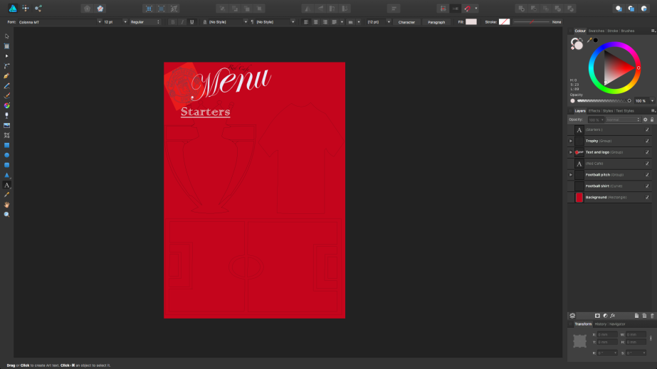
Final Menu Piece

When looking at menus created by other football clubs and doing primary research I had gathered that the one thing I needed to tackle the most is the price. This being wether theres prices on the menu or it is being way overpriced for what is given. With keeping in mind the feedback of this I tried to keep to keep the prices lower, maybe a little too low if the club wants profit. I also needed to make sure that I didn’t pile the menu with a lot of information as people may loose interest in it quick and pick something easy if its time consuming.
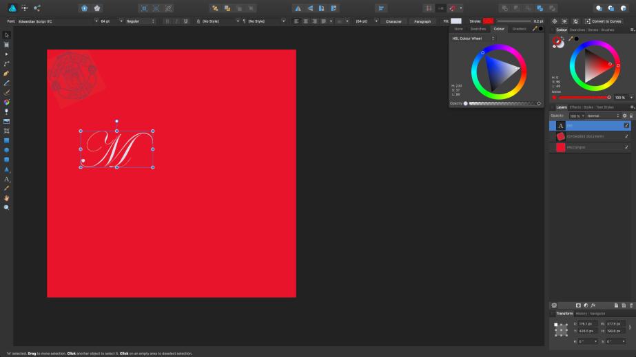
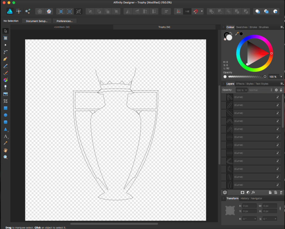
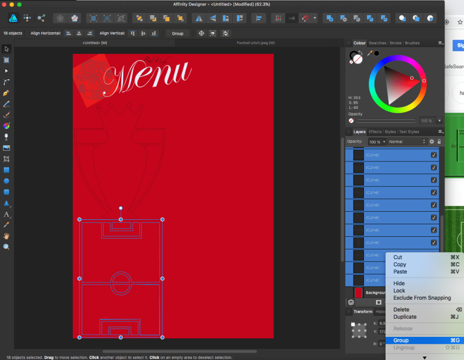
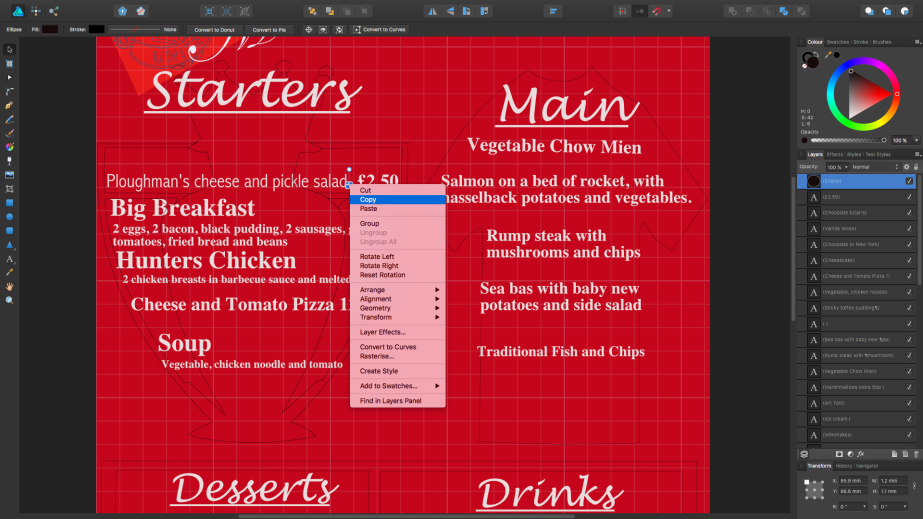
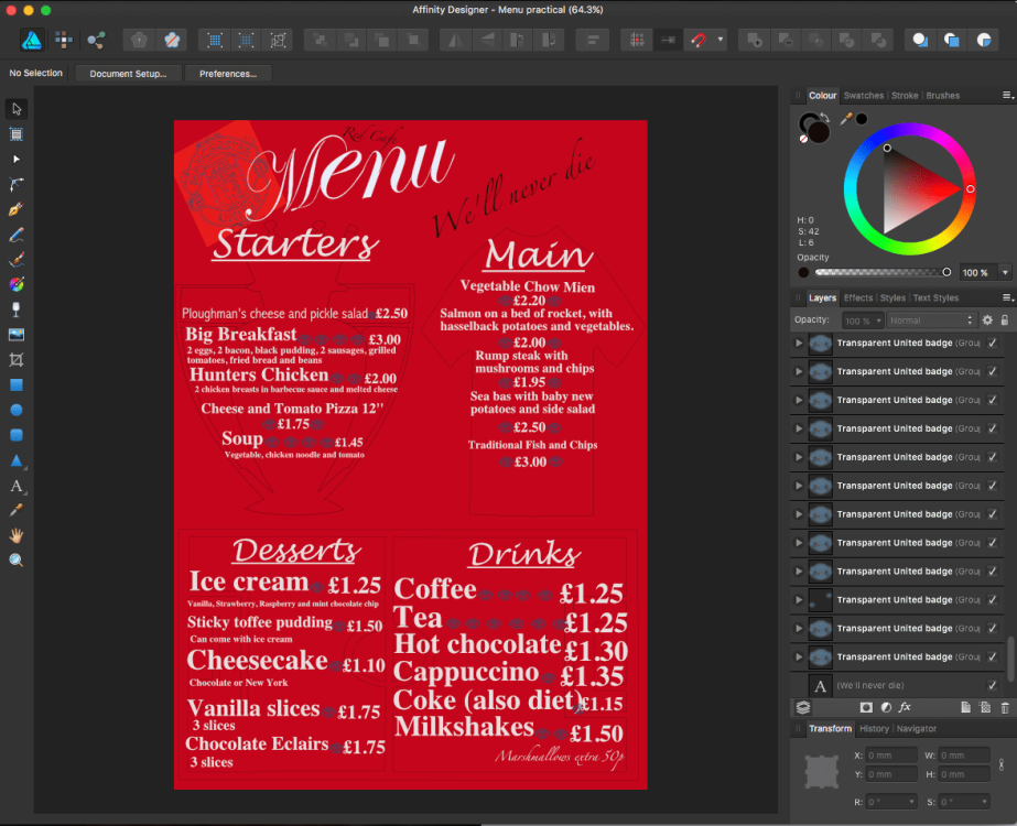
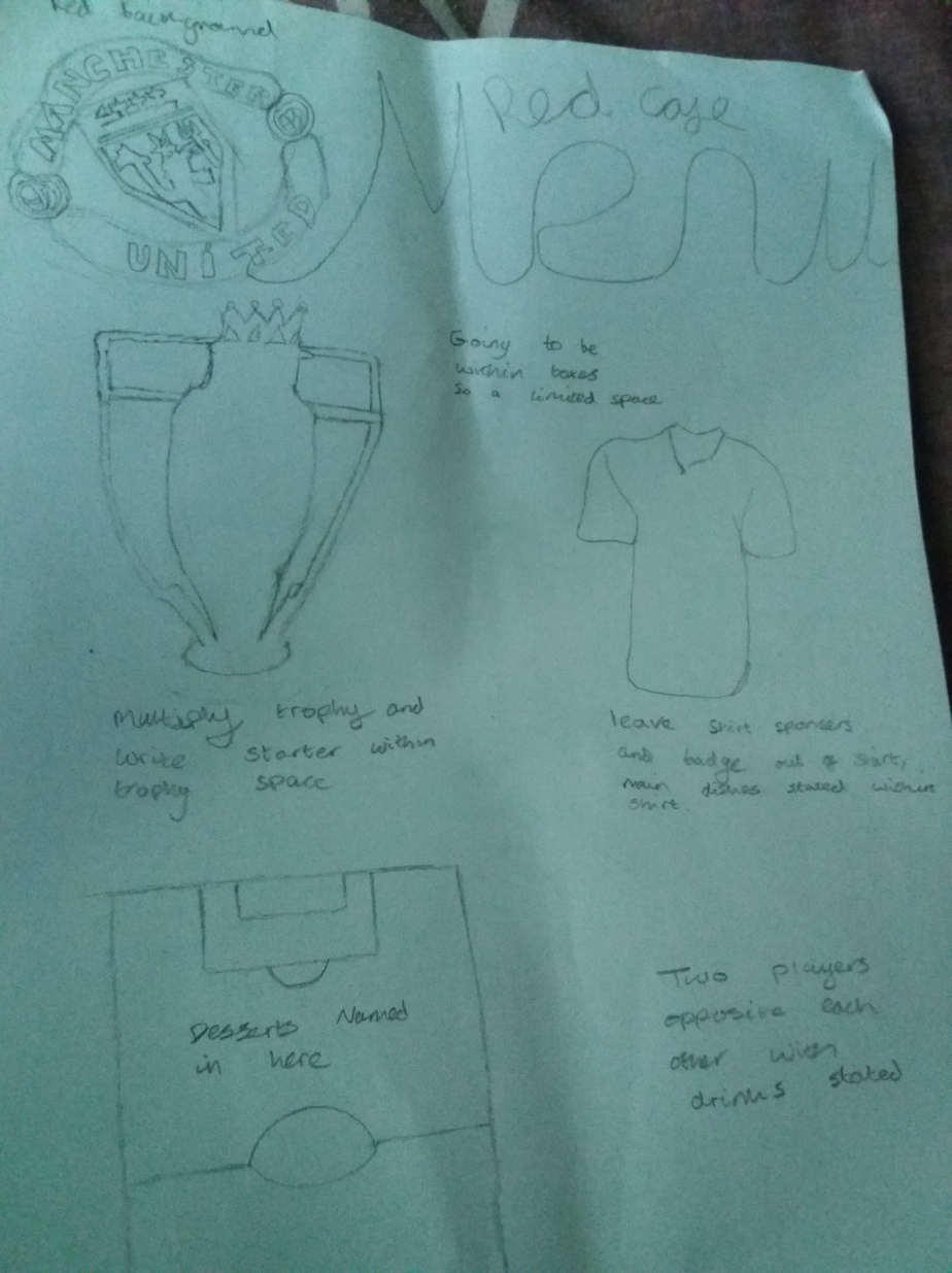
The other thing that I needed to do was make sure that anything I put into the menu had something to do with the club, that’s the reason for the premier league trophy as United have won 13 of these, the shirt being the thing the player always die for and the football pitch as you cant play football without a pitch. Also needed to make this colour co-ordinated. I feel like the solution has been effective but the one thing I would change is the detail in the trophy, short and pitch or I could of drawn out certain players if I had more time and understood some more features.
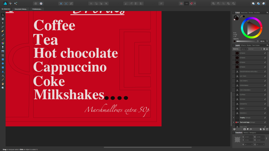
Added other feature like Red Café as that is what the café is called within the club and this wasn’t of the things I aimed to change but thought would be a good addition. Then the we’ll never die is aimed from those that died in the Munich Air Disaster but also talking about the club in general, almost a little tribute that most Manchester United fans may rejoice over if they saw this in the background of something.
To see what other people thought of the menu I created a survey. This survey will allow me not only to know what other people think about the menu but it will ask questions about the problems I wanted to solve from what the target audience had said in my primary research. This is good as I will get a range of answers and will also tell me what things could be improved if I was to do this type of project again in the future. The problem with doing a survey is if I ask any of my mates to take the survey then I may not get proper replies that I’m looking for.
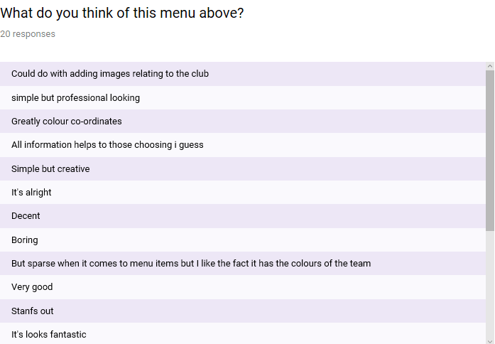
To start the survey off I showed a final product of what I had created so they knew what they was going off. The rest of the replies to the survey will be shown in the many screenshots below.
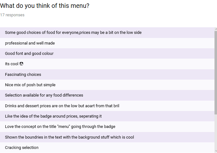
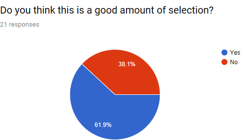
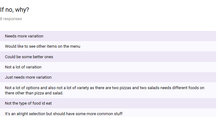
The first question I asked as shown in the screenshots above is what people thought of the menu. The main reply I got is the selection of food which is one of the things I aimed to solve when trying to make this piece. Other things like the use of colour, whether there was too much information on the menu and fonts are also some of the other things I wanted to challenge as this was seen to be a problem in some menus as seen by my primary research. Other things like how it was laid out with text and the pictures was also good to see and good to be recognised amongst everything else.
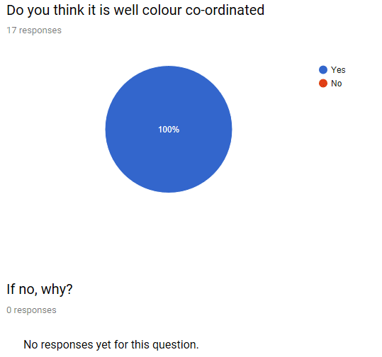
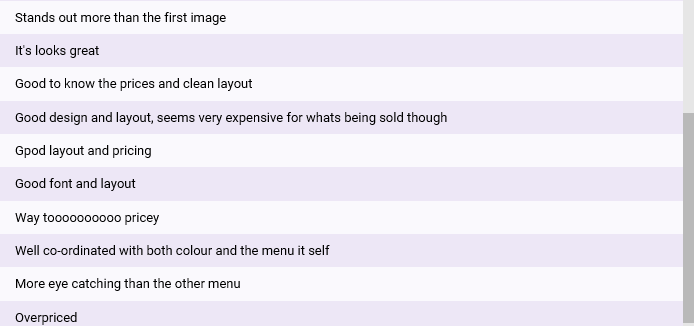
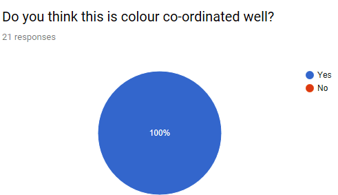
As stated in the above one of the problems I wanted to resolve is making sure that the menu is well colour co-ordinated, this is why I asked this question. As the screenshot shows everyone I asked to take the survey gave me a 100% that it was well done. I did give the option for people if they said no to explain so it could help me learn from it in future projects.
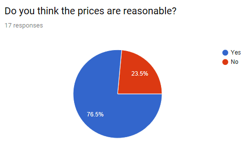
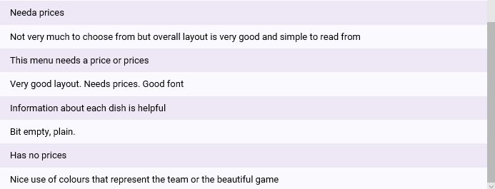
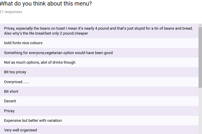
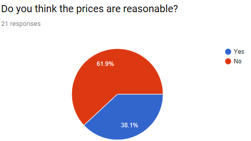
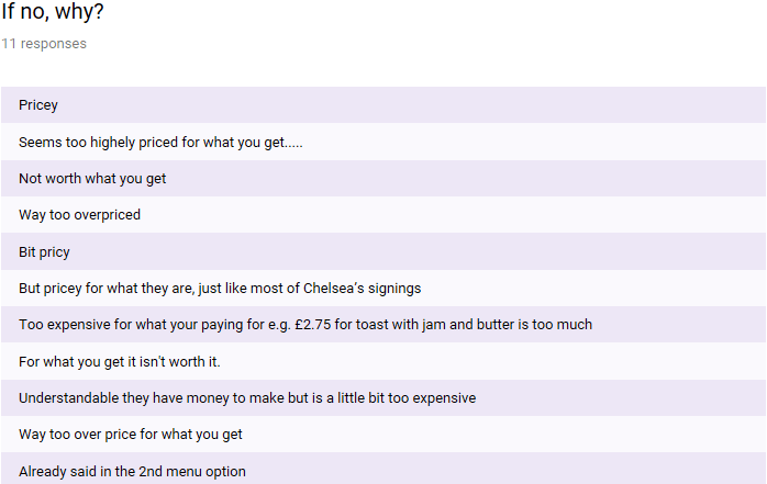
Another problem I wanted to solve based on my primary research is the high prices that was shown in one of them. This is why I asked this question, it allowed me to see if I had made it cheaper with a better understanding of what you are getting within some dishes. The majority of people (76.5%) said that the prices was reasonable but 23.5% said that it wasn’t.
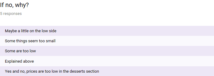
To find out why people said no I gave an option to say why within this question. The main reply being that the prices are somewhat low in some places. I can agree with this especially within the desserts one which is stated in the screenshot above but also in the drinks section. If I do this project like this I will do multiple google searches about menus and the prices to get more of an idea how to price the food/drink better.
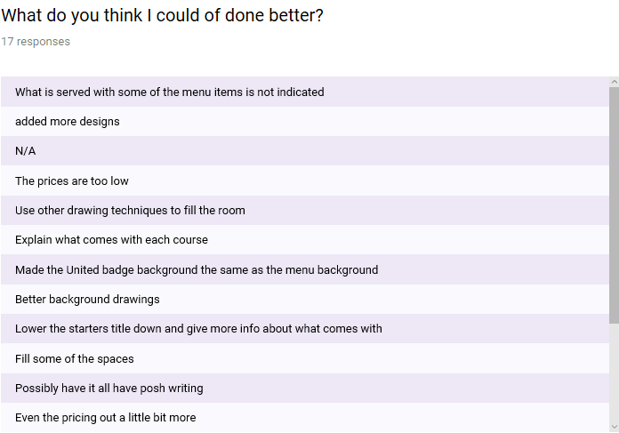

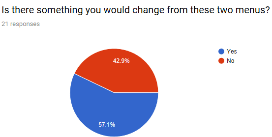
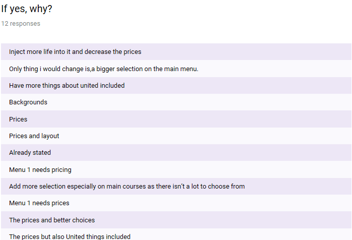
I asked the people taking the survey the best way in which I could improve the piece as the screenshot shows. I got quite a mix result on things I should do. One I recognised is adding more designs to fill the room that was left in some places, I was going to add names of those who died in the Munich Air Disaster but it didn’t mix too well with the idea. Other things about the font was to possibly try to have posh all the way through but if I did that there’s a chance that it may not be able to be read. Prices are mentioned again within this questions. A few people said there was nothing that could make it better. Another reply I recognised is that I don’t explain what could come with the dish on the side or if it doesn’t and people buying need to do this.
One thing I know I should of done is write about allergies and any food difficulties as if someone was ordering they would like to know or at least be able to ask. This would be a problem as it could have consequences if they decide to eat something they don’t know could have anything in there.