Category: Skills Development
Screenplay
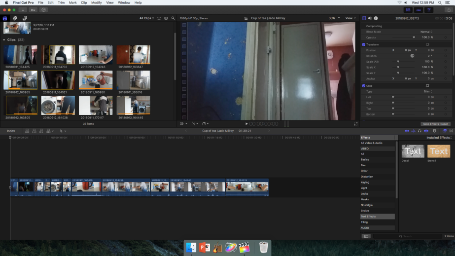
Cup of Tea filming and edit

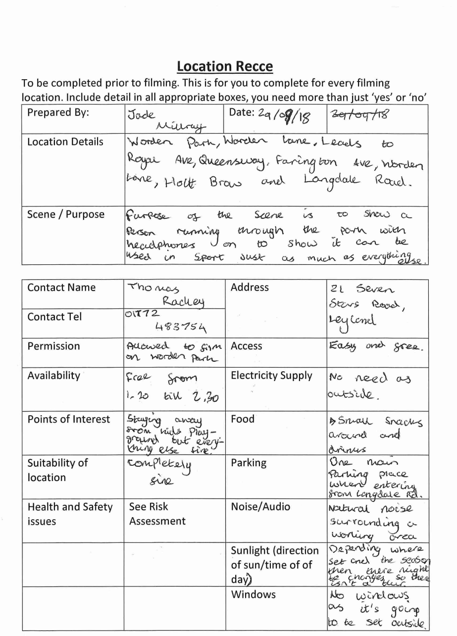
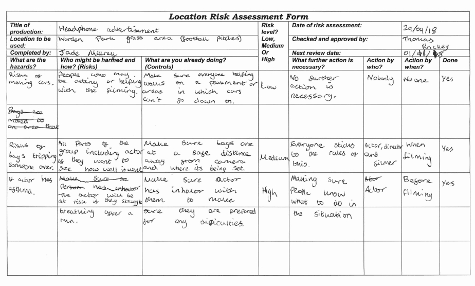
Treatment, Risk Assessment and Recce
Working title: Headphone advertisement
Target audience: My target audience would be teenagers or adults but it also depends one who likes to listen to music. People are most likely to listen to music in a busy area and where noise is at its loudest, out on a run or in the gym and other things similar to this.
Summary of research:
Your product: The short film will see a person running doing exercise in a park which can be quite busy on some days. With this you’ll see the person concentrating on the run because the headphones will be noise cancelling and the person wouldn’t be able to show any signs of recognising a conversation. This will be proven more with the music being louder over the sound of voices talking and any other background noise like cars. The person is going to run towards the camera and onwards while the camera follows until the person is too far out to be seen in the shot.
Props/resources/equipment/location/cast: Props that will be used within the film will be headphones as this is what I will be promoting with the film. The equipment that will be needed is a Canon HD Camcorder and Tripod so I can record but also have it at the correct height so you can see the whole of the person. The location at which the filming might take place is Worden Park because there is more room in which I can set up a camera and film even with all the people that could be around on filming day. Cast is going to be made up of director, actor and a camera worker.
Outline project schedule: The project should take roughly around a day as it is a simple film and everyone will know what they have to do before we go out to film. Locations that I could film at is Worden Park if it is an exercise based advertisement. Another location I could film at is Hough lane if I’m trying to show how good the headphones are at blocking out noise in a busy area. The cast and crew that is required is simple, it includes the actor which will be running, the director so everyone knows what they are doing before and while filming but also a person to film the advertisement.
Budget: The budget of the film is 500 pounds for loaning out any camera equipment there is and any other things that will need to be completed.
Photoshop Basics and Poster Recreation
Photoshop Basics
When using Photoshop to make a thumbnail on the first day i realised i needed to learn more basic tools of Photoshops and any shortcuts that will make it easier when designing things e.g. posters for films. With this in mind i can change a picture to the way i want. Example of this is if i want a car to stand out over the background then i would use adjustments such as brightness, exposure and hue/saturation.
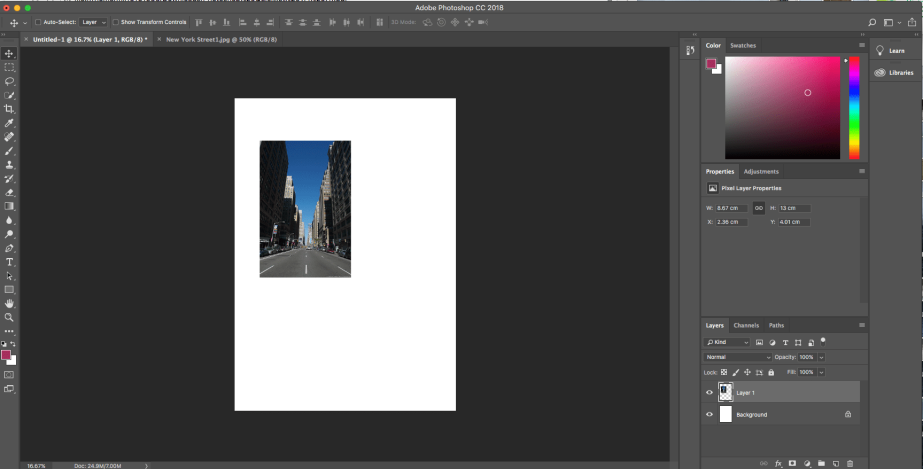
From the screenshot above i had downloaded a picture of a street in New York. I added this to my main design page and pressed cmd+alt+T so then i can make the picture fit the background paper size (A4). Keeping hold of shift so the picture stays in resolution before pressing enter.
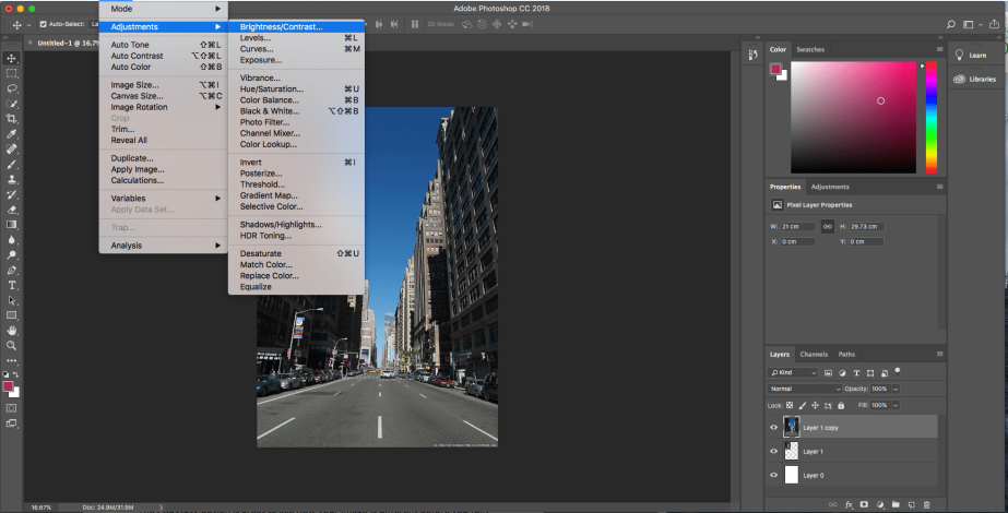
Screenshot above shows the different adjustments i can make to a picture as explained before at the top of the blog. They are all the things that can be changed to a picture but instead of going the longer way round i can use options to the right where the option properties is at.
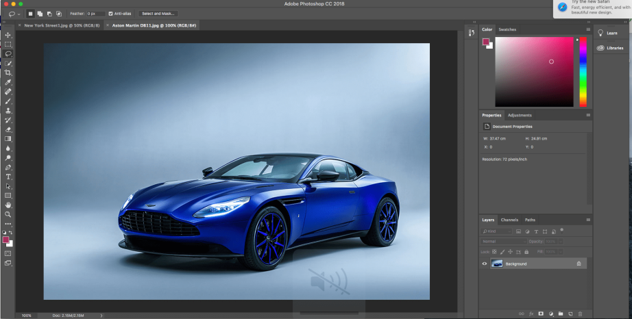
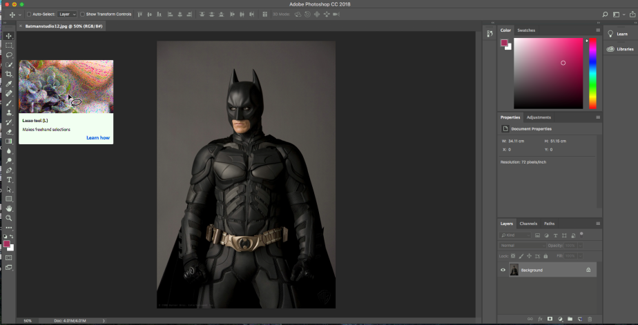
On the screenshot above i am going to use the Lasso tool to cut out the car so i can take the car into my work instead of the both the background and the car especially when i don’t need the background when i’ve created one ready for the car.
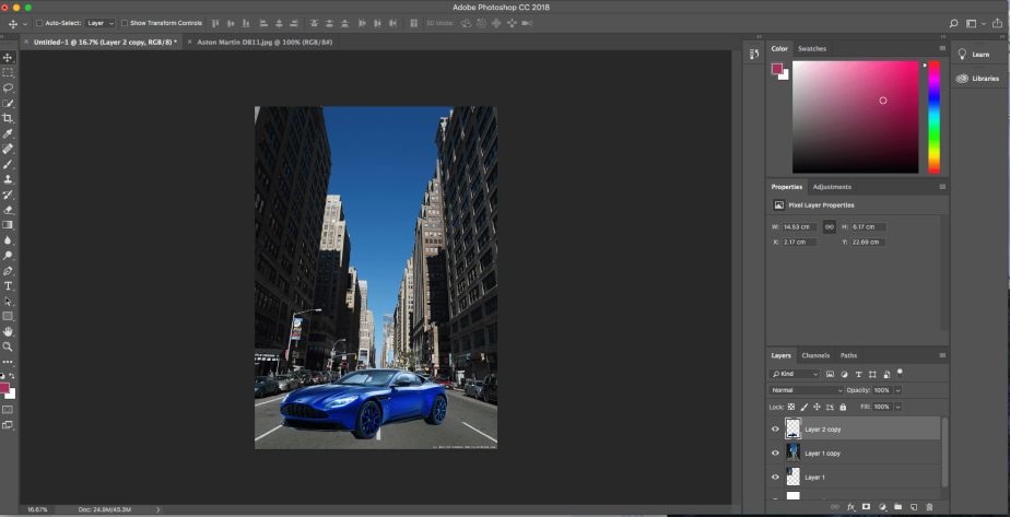
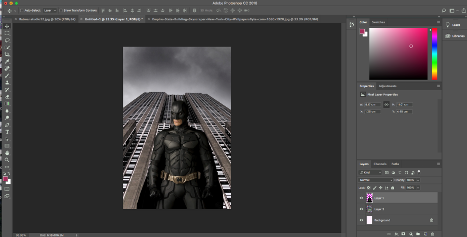
Screenshot above shows that i have moved the car into the file i was working on. The car being at the front is a kind of show off point in front of a large city.
Poster Recreation
After doing some practise Photoshop work, in class I tried to recreate a poster from the film “The Dark Night”. Started off by downloading pictures of a building, batman and the logo. Created a new Photoshop file and started off by adding the pictures or cutting them down so they can fit the picture. With doing this it helped with trying out more new things that could improve any work digitally but also help with any future projects that might need effects added and so on.
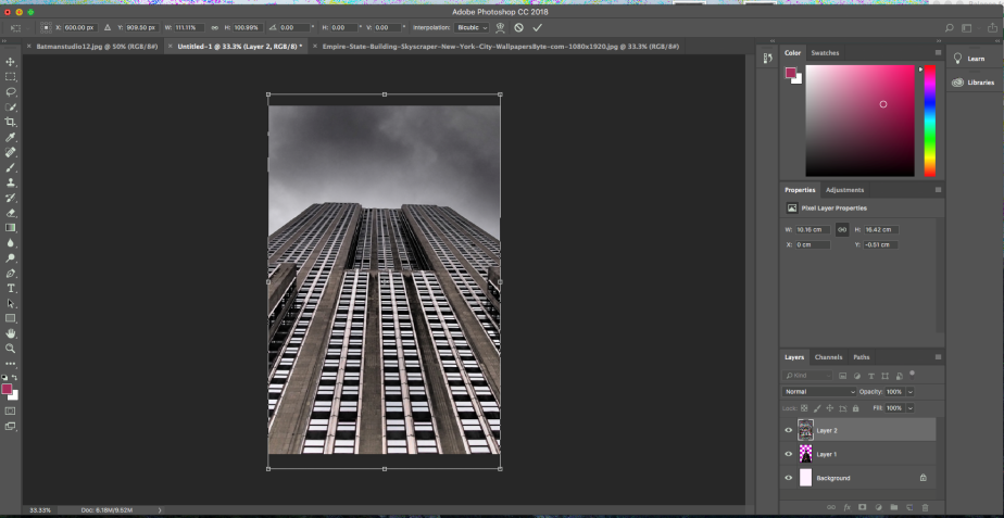
Here you can see I have dragged a picture of a building that was open in a different tab to the tab in which I was creating the poster. With this I tried to make the picture fit the size of the original paper. By doing this I pressed keys that gave a shortcut which was “ctrl alt T”.
In this screenshot you can see that I’m hovering over a tool called lasse which allows me to cut out things I need but also allows me to remove anything I don’t want at the same time.
Here you can see I have added the cut of picture of batman on top of the buildings layer and right in the middle so it looks like batman is stood in front of building with a low wide angle.
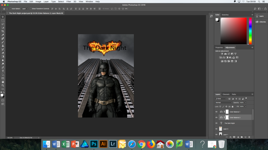
In this screenshot you can see that I have added the batman logo and the title “The Dark Night”. With this where the layers are you can see two layers called “colour balance 1” and “colour balance 2” which gave the building a darker look but also to the sky which helps the logo stand out.
Final Cut Pro X editing
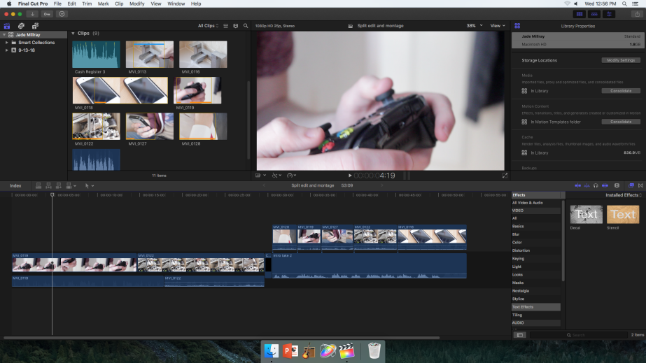
The first time using Final Cut Pro X i learned the simple skills of the programme and also the shortcut commands of the keyboard. Learned how to shut down libraries because when the next person who uses the editing programme will see and can change or delete any work if it isn’t shut down properly. When starting any type of edit I need to import at least 8 clips which can be a starting point of deciding what I need and don’t need. So with the clips being imported I can start adding ranges to the videos so then any parts I don’t want within one of the clips it crops out the outsides. To favourite a range I can press F but if I didn’t really want to click this I can press the space bar to delete the favourite but not the video. I can use many shortcuts for the in and out points within the programme. Examples of this is that I creates an in point and O creates an out point, shift+I goes in to the point whereas shift+O goes to the out point, alt+I removes and in point while alt+O removes an out point. To move the ranges into an actual video all I have to do is drag and drop where I can crop it more to fit previous clips so they will go together in the final video.
Bladerunner audio task
As part of
Original Horror Poster
The sub genre I am going for is killer. This sub genre can go down many other genres but I have chosen the smaller sub genre in Slasher. In this category there is films like Halloween, Friday the 13th, A Nightmare on Elm Street and scream.The idea that I have for the fictitious film is that the character is going to wear a mask so you cant see their face or any facial expression that may show fear or anything that suggests the character is anything but got a scowl. The character is going to have blood around them when creating the poster. Location is going to be inside of college and in the photographic room. The reason for this is that I can decide where I want the light myself with the black background.

The saw poster colours gives you a feel of death because of how light the white is for the background but also because of the not so colour in the hand apart from really dark red blood. The blood around on the hand but the part where it has dropped down from the wrist end of the hand, scattered around the thumb/fingers and on the dried off blood on the hand. The layout is the same kind of idea as most films poster by having writing at the bottom that tells you who the directors have worked with (actors, companies, when the film is going to be released to the public and any reviews) and then having the top half to be an idea what to expect in the film. Images that has been used out of everything is the hand and lower arm, the drops of blood and dried blood.
The hand could of have some relation to the film as it could be a prop. Lighting is full on white for the background apart from the blood but also the top part of the poster where it looks like chalk being spread across a uneven object with holes in. The typography of the title is bold but the w is stretched out giving an uneven feeling towards the film. The tagline says “every price has a puzzle” which portrays SAW is a puzzle waiting to be sold but also at the price in which someone or something was willing to go. With taking into the account of the poster you can tell that this is some kind of horror story but also the meanings and slogans that has been used in the poster. The reason why I think its stayed in its genre is because of the use of blood but also the hand because if paranormal things are happening then surely they will be left with some kind of mark in its recognition.

The posters slogan “evil has a destiny” gives the idea that every evil person will always have somewhere it’ll end wherever it might be. The typography of “HALLOWEEN” is bold but doesn’t give much away or any type of uncertainty. The use of colours are mixed of black but also a fire kind of colour which is a natural sign of danger. Making the release date to be a different colour so people can actually see it from the background (black). The wording below the title is to let people know of the actors that worked on the film, who the film is sponsored by, the release date and any ratings the film has been given from early access film watchers. Above the title of the film to the right it tells the audience who the film was based on or off based on writings or the person in life.
The layout of the poster is like usual other film posters where the actors, companies and other information the audience needs to know about the film but the top half is pictures to do with the films. The images used are trees and a house to give the bottom half background which could give you the image in you head that this house is the only one stranded in the woods like a secret lookout. The image with the big face with what looks to be a fire type colour with little people which will make people presume that they might of been the victims if a film has been based of someone. Comparing this with the Saw poster you can tell there a lot more that has gone into this poster and more in your face than the Saw poster. Similar types of colours used but the colours used for the fire parts. They also had similar layouts with the wording but also writing.
Film Poster Graphic Designer
Kyle Lambert- Stranger Things
Kyle Lambert is an illustrator and/or digital editor than has done posters for Stranger Things (Netflix show). To add to this he has done poster work for Jurassic Park, Jumanji, Muse which is an album cover, the Wizard of Oz and many more for many other films and producers. He started of originally in oil paintings before moving to digital productions. The things that has to go into what he does is research, experimentations of any ideas created and to see what kind of things work and what doesn’t. Also has to know how to use new tools and technique that helps to improve his work. Some quotes about his work and thoughts/processes:
“I think it’s the simplicity of the Mac that almost encourages you to question what else it is possible to create”.
“I am the perfect case study of someone who bought an iPod, fell in love with how easy it was to use and became curious about the advantages of using Apple computers for creative work”.
“I’m not really that big on downloading apps. As you’ve probably noticed, I spend most of my day immersed inside Photoshop. I’ve been making my own brushes and textures now for so long that I rarely need to use any additional software to complete a painting”.
“My workflow at the moment begins on my iPad in the app Adobe Ideas. It’s a great simple yet powerful app that allows you to create detailed vector sketches. I often start with very loose doodles and then refine my ideas by working over the top on different layers. I will also begin exploring colour and tone to develop the mood of the piece”.
“But just because you can do something doesn’t mean that it’s always the best way of doing it”.
Websites used:
http://www.kylelambert.com/about/
While going out in a group to get pictures for our own horror posters someone in the group recorded behind the scenes which are shown below.
Semiotic Analysis film posters

Water bottle fountain sequence
In class we discussed terms like continuity of action, cut in, jump cut, leading space, 180 degree rule. Continuity of action would be used in practical work when the actor is going to keep the same pace e.g. when walking, talking and a lot more that can easily be affected when being filmed. Cut in will be used when more that one set/place is needed to be filmed, an example of this would be having two different clips don’t go in a continuous loop so you might use transitions or effects from one to the other clip. When using jump cut in any college work id have to have the same thing being recorded in the same area with only a little difference of camera angle that would show me jumping forward in time. If I use the 180 degree rule when filming something then I would use it when two people are having a conversation and make sure I keep the filming in the same place all the way round the two characters.
When taking on the role of director I found it quite easy to direct the cast and crew because they was free to listen to my ideas but also advance on the ideas going but they also did everything that was asked. The things that I would do differently on set next time would be to make sure everybody is doing something that can benefit the people around. The things that went really well is the fact the actor knew exactly as he/she was told to and at a reasonable speed so the person operating the camera can move the camera at the same speed when intended. As well as this we worked well as a team to make sure everyone was ready at intended places before recording, moving etc. When I was directed when I was operating the camera I was directed well. I was told where I should be placed, what I need to record before stopping and was also helped setting the camera at the right height from using the tripod. I learned what to press to start to record, how to make the camera focused on the person but also the words that everyone around you know means filming or being ready to film. Below are some pictures that was taken showing what was happening when recording.


First edit of water bottle fountain sequence:
Final edit of water bottle fountain sequence:
In the first edit the sequence was put together quite well apart from some parts it is choppy because the actor doesn’t straight away walk or the walk is slower cause the pace hasn’t been kept through the filming. So in a further edit I would speed up the shot where the actor is going slower. Id also change the sound because in the background you can hear a lot of talking and not really any sound affects apart from a little sound from the water filling area. The way in which the order was done from the first to the finished version was the same, nothing needed changing based on the order. The reason for this is because even if we filmed something again then as a group we made sure that it was done in the exact way as other the original one.
In one of the clips you can see the actor walking towards the water bottle filler machine going slower than in other clips so this needed speeding up so the pace of the video could stay the same. When I cut in on the first edit and the last edit is when the person carries on walking instead of standing and then walking. With the rules of continuity in mind I think that the idea of this can apply to my edit because the person continues to walk in different shot angles but some shots leading to others are a bit jumpy. If I was to do this again then the thing I would do different while filming is making sure that the actor stays exactly in the right place without having some movements that might affect it from the point of being the hand moving or something similar.
