Methodology

Sampling

  • Random Sampling

This is where there is an assigned amount of numbers to each sample where they are then selected at random.

  • Systematic Sampling

This is where every tenth, twentieth and so on is selected from a list.

  • Stratified Random Sampling

The sampling frame is split into groups based on variables, gender for example. Then the sample a percentage equally from each sub division.

From doing there’s researches doing this they will know that Quantitative data methods are easier in creating greater reliability.

The validity of some companies research depends on how it was conducted. A random sampling may give more validity as it is random person picked but id someone got bored of the way in which this was done they may lose interest towards the end. Same with systematic sampling. Stratified Random Sampling may give more validity as it is based on many different things.

Research is done to prove or disprove a hypothesis or to learn new facts about something. This starts with coming up with the theory or new facts then checking the reliability/validity, the sampling and testing is done then the research is conducted then applied. This happens every time research is done.

Hepworth

One of the things that I needed to do in class is research Dame Barbara Hepworth and put the key things in a document while also using the method of quota sampling where no sampling frame is used but it is more self research on the internet and so on.

Survey

To find out what people thought of her work and to find more information I created a survey where I was going to ask people this. This is important because I can also gather that other people think about the work I had researched about.

See the source image

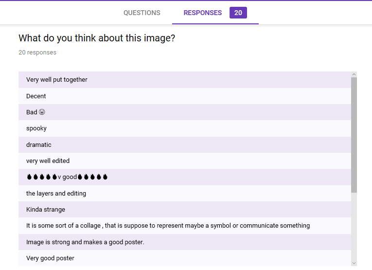
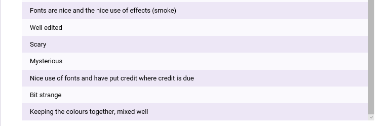
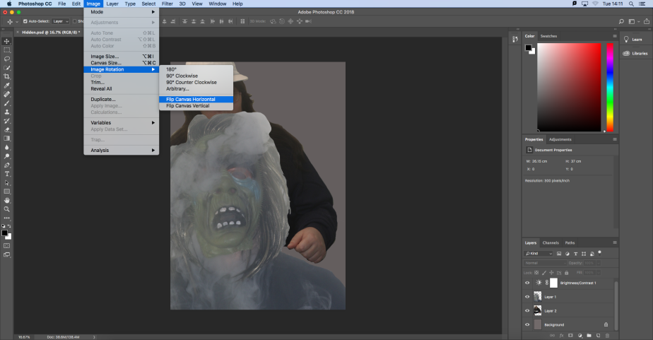
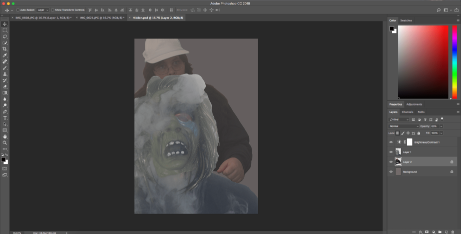
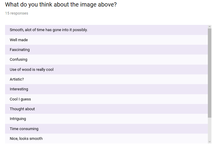
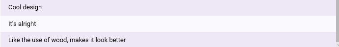
In the screenshots below I asked about a picture shown above and what they think about it. It shows the type of answers I got.

screenshot (34)

screenshot (35)

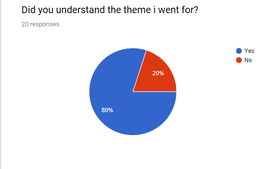
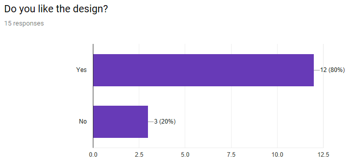
The image below shows that I asked if they liked the work of the image shown and this is the results I got.

screenshot (36)

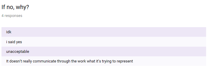
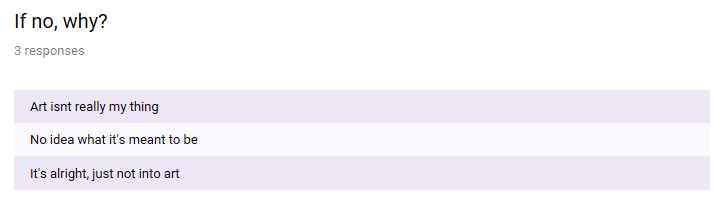
I then proceeded to give an option for the people who said no to explain why and the reasons for this is shown below.

screenshot (37)

In the screenshot below I asked if anyone would like to know more on the person and these are the replies I got.

screenshot (38)

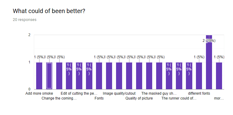
From sending this survey out I realised that I could of asked another question for example if yes what would you like to know so I can get more of an insight so I know what exactly people would of liked to know.

Demographics and VALS

Demographic are quick and simple way in which audiences are categorised.  They can be categorised by:

  • Age
  • Gender
  • Race
  • Religion
  • Social demographics which include lower (D,E), medium (C1,C2) and higher class (A,B).
  • Income levels
  • Education levels

https://www.dictionary.com/browse/demographics

It doesn’t matter the demographic, the individual audience is defined by their values, attitudes and lifestyle. Young and Rubicam developed this for marketing companies which is more specific to advertising. Some products tend to have a wider appeal but the categorisation is based on the one of seven areas but mainly looks at the persons outlook on life.

The aspirer likes to be high up in status and how they are thought about. They do their best to buy fashionable and expensive brands. Can be influenced by celebrity endorsements. The explorer are people who are driven by the need of discovery, challenge and new experiences. Like to try out new and emerging brans and products. The mainstream is normally the largest group as they keep with current popular trends. Tend to go with tried and trusted products and wont often go out their comfort zones. The reformer values their own independent judgement, and are not often influenced by brandings and popular trends. They are socially are of issues and often only buy branded products when essential. The resigned are predominantly older people with consent unchanging values built up over time. Often cant reason with contemporary issues. The strugglers live for today and make few plans for tomorrow. They decide things on a whim and they often seek escape from reality. The succeeder possess huge self confidence, tend to occupy positions in reality. They will consume products because they feel they deserve the beneficial gain.

http://www.tmgnj.net/tag/yr/

Surveys are a way in which a person or a company can ask a range of questions or a question about a product to a range of people that may be interested in that product/products. With this get opinions of the people asked. Pros of surveys is that they are cheap to create. Another pro is that there is many ways in which surveys can be given out e.g. by hand or via email. They can also give some precise answers depending on the type of questions asked. The cons of surveys is that if you ask someone you know they may not answer correctly and may contradict with other answers. Another con is that the design of the survey cannot be changed through out or someone may think it is something else.

received_2252251585024069

In this survey I went onto Instagram and asked my Instagram followers which genre is better with options of horror or action. I should of said “what genre do you prefer” over “which genre is better”. Found out that the majority of my followers like horror over action. If I was to gather more I would use horror going forward along with other genres to see what the main genre would be liked. A problem with the survey I did is the fact more people that follow me are around my age, this means if I asked someone older then this could of been different.

Final Evaluation

In my project I have two main characters within the poster. If this was made into a film then they would be the two main characters within that too. The main character that is wearing the mask is the scary horror character within the film while the one that is running within the poster is the one that is being attacked by the spookier character. My idea originally starting with taking photographs of a masked person behind a tree but from research conducted earlier on in the project inspired me to build on that idea. The main blog post that inspired me is secondary research. The reason for this is because in my final piece there’s use of smoke (vapour), still use of mask but there’s also another character involved.

Using primary research also helped me in deciding which one is more seen as too mean as hidden. With most people choosing one option I realised that with that kind of response I could do another thing which can persuade them and making them realise there is many other ways in which hidden can be portrayed. Although masked was chosen quite a few times there was still ways an edit on Photoshop could of changed the smallest things.

My final idea with the poster correlates with the project hidden because within the poster the monster character is covered up by a mask but also by smoke (vape) while the normal character is hidden behind looking ready to run. The poster is meant to represent the horror genre in some way. Some traditional horror films include mask wearing monsters while the ones they tend to aim try and run away, which in most cases doesn’t happen.

The ideas was helped during when I was told to come up with ideas. At first I wasn’t sure what would be the best way to describe hidden because one to go to is out of sight. I found out more by researching many other words in which hidden could mean which is shows in the blog “ideas for hidden”. I tried many different edits using many different techniques, one of these being a disfigured face which I didn’t because this didn’t go in with the horror genre I chose to go down at the start of the project.

I wanted to find out what other people thought of my work. To do this I used Google forms to create a survey in which I can ask a range of people to complete. I wanted to mainly find out about what people thought was good about it but also if there was things I could improve. These results are shown below.

Screenshot (29)

Screenshot (30)

The poster got quite a mix reaction. Some people said it was scary or spooky or things that relate with this while some said it was a well edited poster. While there was majority a few good answers I got one that was more confused about what I had created, almost questioning themselves.

In this screenshot below this is the part where I asked what people thought I could of done better.

Screenshot (31)

Most people who took this survey said that the main thing I needed to do is use different fonts while one went into detail saying that I should of used a different font for the text “COMING SOON” like the one I had used for “HIDDEN”. Some other people said that I should of added more smoke around the person/monster. A lot of other things included are the way in which the people was cut out, having rough edges but also because of the quality of the picture of the monster. Two comments that stood out to me is that the running character at the back should of been at the front while the monster is at the back. I agree with this as this would of looked more of a threat for the normal character.

In the screenshot below I wanted to ask if people understood the theme or the point of the poster.

Screenshot (32)

While the majority of people said they understood there was also some people unaware of this. I gave an option to explain why and this is will be shown below.

Screenshot (33)

The main problem with surveys is the fact that people may not give proper answers if you know them and two of these answers are a fault to this. But the last comment is what I need to consider more when making posters that everyone know the point of it or it will disinterest people.

Legal and Ethical Constraints

One thing that I need to consider while producing the photographs for my project is copyright. To find out more about this within photography I used the website https://www.copyrightservice.co.uk/protect/p16_photography_copyright. This tells me that if I use someone else’s work (photography) then it will be a problem but I will be taking photos of my own.  If I was to use work that isn’t mine I would have to ask permission which could possibly mean paying. With this their is legal model forms that has been created and can be seen on the internet if I do use work that isn’t mine but with doing a shoot myself, I don’t really have to worry about this part as much as I know the work I will be creating is the work I have made myself with people around me.


Making Of Poster

From doing the 3 edits i decided on which one was better and what correlates with my original ideas but also the way in which I had added to my idea from research i conducted but also found. So with the screenshot below I opened the already edited file so i can add to this.

Screen-Shot-2018-12-13-at-14.21.13.png

In the screenshot below i am showing that i plan to to add text but this is gonna be vertical instead of horizontal because there is more space on the right hand side for text where is possibly may not work if i had horizontally as this may get overcrowded.

Screen Shot 2018-12-14 at 11.33.02

In this picture below i am choosing what type of font I want based on the examples next to the font names and i chose this one because this will go with my idea well, especially with it being half there and half not.

Screen-Shot-2018-12-14-at-11.47.13.png

In this picture below i have used the colour option to get the colour I want. The reason why I don’t want the typical writing of black is because if i’m trying to get my idea across then I need to make sure the person viewing knows what it says, mainly because I have used dark colours.

Screen-Shot-2018-12-14-at-11.51.58.png

In the screenshot below i have added the text and moved it over to the part where it isn’t too busy, from here i plan to change the colour of the text and put other added information within the poster.

Screen-Shot-2018-12-14-at-11.52.23.png

From here I am going to use more of the text tool as I need to show some key things for the film if it was to be made. While doing this using similar colours that go with the colour theme already within the picture.

Within this screenshot below i have messed around with the colour of text that says “COMING SOON” and decided that black suits the poster more. While in the bottom right corner i have given credit to the actors and used a lower but brighter blue.

Screen-Shot-2018-12-14-at-12.09.30.png


Edit 3

Screen-Shot-2018-12-13-at-12.54.52.png

In this picture I have used the lasso tool within photoshop to cut out the eye so can use this to add to another photo that I have took for the project.

Screen Shot 2018-12-13 at 12.38.37

In this screenshot above i had moved the eye i had cut out like shown above and moved it over where the characters eye is. Using command and T I could resize it bigger and tilt it slightly to fit the face.

Screen-Shot-2018-12-13-at-13.26.04.png

In the shot above i have used the lasso tool again to cut out the shape of the mouth.

Screen-Shot-2018-12-13-at-13.28.35.png

Here in this screenshot it shows that i have dragged the cut out shape above onto the file i was editing. With this i used command and T to resize and fit the area i wanted it too.

Screen-Shot-2018-12-13-at-13.26.04-1.png

Even though the screenshot doesn’t show this properly because the eye isn’t really covered by the squares that the usual tool portrays was because it moved already. This was moved to the main tab where i was editing a picture.

Screen-Shot-2018-12-13-at-12.51.01.png

This screenshot shows the point in which i dragged this too. Using command T the box comes up, the reason i do this is so it fits each part of the features i have cut out.

Screen-Shot-2018-12-13-at-12.51.19.png

This is the final way it ended up. I don’t think i will use this as my poster piece as this doesn’t really give of a horror film. Its more disfigured and thats not what my original idea started as

Edit 2

IMG_0608

Within the image above i used this in photoshop as a base picture to see what i could possibly do by editing things out or in.

Screen Shot 2018-12-11 at 15.05.11

In the screenshot above i have cut out the outside of one of the models/characters head with the lasso tool and plan to move the part over to the first tab where i plan to play around with what could possibly work.

Screen Shot 2018-12-11 at 15.02.53

I tried to make the character fit the body but cause of the shape of the head but also because of the angle in which the body is at making it harder to fit together.

Edit 1

To be able to create something id like I needed to test out the different images in which I had taken in many ways too see which one I liked and can take further into creating a poster as my final piece of the project. This part is important because if I do something wrong or needs improving I will know and will keep this in mind when and if I do another project that involves photography with editing.

screen-shot-2018-12-10-at-09-39-31.png

In the screenshot above it shows me creating a new document on Photoshop but the part that is underlined with options out but this all about the background. The reason why I clicked on background colour is because I didn’t want a solid white or black colour background, I wanted a unordinary colour but also something that would go with pictures took.

screen-shot-2018-12-10-at-09-39-45.png

In the picture above it shows the point in which colour I picked after playing with this feature to try and find the perfect colour that would suit the colours that are included of photographs took for these edits.

Screen Shot 2018-12-10 at 09.47.46.png

In the screenshot above I had used the lasso took to cut out the image to the point I was satisfied with before dragging the cut out piece to the main document piece where I planned to create the meaning more.

screen-shot-2018-12-10-at-10-03-11.png

In the picture above I played around with the image before deciding where the best place for the image was. This point I should of just waited for the other photo I was going to use to be in the picture so I could of played with it more.

screen-shot-2018-12-11-at-09-30-15.png

In the screenshot above i have adjusted the brightness and contrast as i wanted to make the background a little more darker while the contrast of the colours are also made a little darker, allows the character to stand out to the background.

Screen Shot 2018-12-13 at 09.14.24

In the picture above i have used the lasso tool to cut out the outside of the model so then i can drag into my hidden tab to work on.

Screen-Shot-2018-12-13-at-09.47.57.png

In the screenshot above you can see i dragged the original image over to the hidden tab and started to play with the way in which i could put the character. I put the layer behind the monsters character because i needed to hide the face as a smiling face wouldn’t really give a horror theme. Using command and T it allowed me to resize and also tilt

screen-shot-2018-12-11-at-14-11-49.png

In the image above i decided to try using the image rotation by choosing flip canvas horizontal and i feel like this makes the image better than what my first edit was.

screen-shot-2018-12-11-at-15-19-22.png

In this screenshot i have shown the final part of the edit. I like the way in which I’ve done this because i feel like this would be a typical horror theme but also because of the way in which i could edit certain parts to make it look better.


Production

To be able to create a final idea I need to make sure I have created a wide range of photos that correlate with my original ideas but also anything that inspired me to add to that idea. One of these is to have the masked model to be alone and not hiding behind anything because I could possibly change that when editing things to my liking. Taking a wide range of photos will help me in choosing which one would work with what but also I can do many edits before choosing my favourite.

In the picture below this is a starting image I took. The reason why I started with a white background and bright light on the model is because I wanted to try different ways in which the light could create the shadow but also if it impacts the face within the photo. Main idea was to have a person with a mask on when I first created some ideas to go off, I added to this by having the model to vape through the mask to make it look like the monster so to speak breathes out smoke.

IMG_0608.JPG

In this picture below it correlates with the top idea only this time I tried a picture without a shadow but also took a picture with a little less vapour. I liked this one more because if I try to edit this in Photoshop I can easily go around the person whereas with the other one I may need to decide if I want the shadow of the background included.

IMG_0609

Within this picture the idea was to have a black background which could of made a background of a poster or something similar. I like the way the background is set out but the thing that ruins this is the fact in which it is blurry. The thing I’m going to take on in the future if I try another photography is to make sure to wait a few more seconds before I move the camera so I can get a better picture and make sure it is in focus.

IMG_0617

Below the picture is basically correlating with the picture above. Again the picture is blurry and like stated I will make changes when making future projects. This picture could be good in a way too because hidden could also be disfigured and with this blur this makes the model/monster character look this way. In both pictures I feel like if this was in focus the lighting and other things taking into consideration this could of possibly made the mask and the vape smoke stand out compared to the background.

IMG_0618

In my original idea I chose to just have a model in a mask. I decided more as I got more into the research stage where I was then able to build up on my idea. I was inspired to have another person because if I am going to create a poster then I needed a main character in the monster and then another character the monster goes after. I like this picture below as the lighting is right for the photo, keeping the idea hidden within this photo was by adding the hat which makes the light around the eyes a little more darker. What I wished within this photo was that the hair was out of the jumper. A problem with this photo is the smile in which the model has, this doesn’t portray a horror genre feel.

IMG_0619

Within this picture I used a different style of background instead of white I used brown. Here I used bulb lighting and I think this is perfect for this photo. Although the person is not hidden by anything, if I edit this into another photo with one of the images in the top part of this blog then I am able to play around but I can also change the layers so the monster is on the front while the character is hiding behind.

IMG_0623.JPG

In the photo below I asked the model to act like she was running away from something that is out of the ordinary. The lighting makes the person see able but also makes the small things standout. I like the way in which the model shoes concentration in what they are doing like I asked. This image could work perfectly when edited with one of the top images and with the idea I said from the last picture.

IMG_0630.jpg

Continue reading “Production”