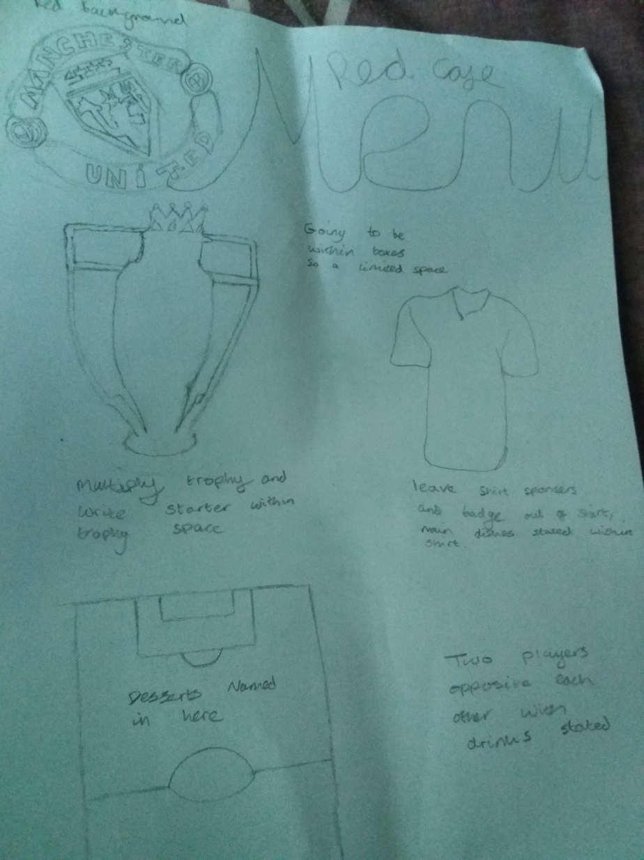
Above is the sketches I created, with writing explaining each part and what I plan to do. This sketch could possibly change when making the menu as I need to think about page size and how I’m going to fit it all into one page, one part may give and I think that will be the two players drawn out because the pitch could be moved landscape and desserts named in one while the other has drinks in like planned. Doing this sketch was important because it gives me an idea what it will look like but also makes it easier seeing this as I don’t have to mess around after creating things to try and make it fit the best of my ability. One thing I missed out in this sketch that if I have room I am going to put the names of the players that died in the Munich Air Disaster as they are the main reason we have a club now and died doing what they loved.
From research conducted I have decided to have red as the background mainly because this is the colour of the club. Going to use the colour black for outlines of drawings drawn out on Affinity (shown above) so then this doesn’t override the menu itself, with this black also being a club colour for many seasons. Going to have white as the writing so this is shown over the colours as the red is going to be a darker colour but also in the past it has been a club kit colour. When it comes to making this menu I am going to test out many fonts as I want a mix of classy but also simple so it is easy to read making it easier for the customer/client.
The layers are going to be quite different. To start with it will be a background, other things like the lines and curves will be grouped into a layer so I can move it all at once while still being able to change parts by double clicking on the things I want to change, this will be done for each drawing I want to create. Most of the text is also going to be grouped but some will be a layer itself because I can move it on its own but it is individual for moving in a way I want it to be.