Final Evaluation

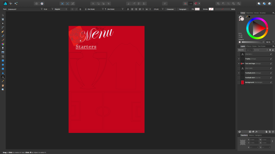
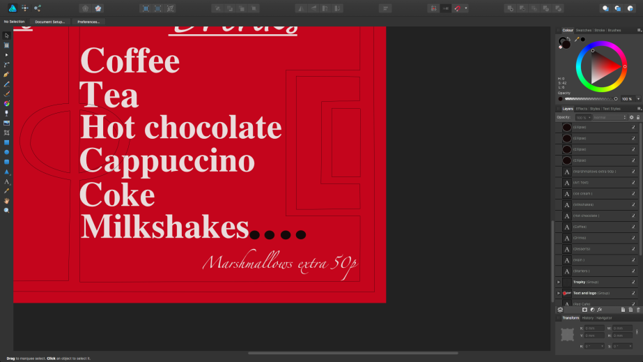
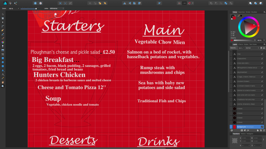
The final edited piece is shown below.


Using this video I created a survey. This survey will help me in knowing what other people think of the short film. With this I can find out what things other people think I could of done better, if I created the film in an okay matter and also if they understood what the film was about from what was shown. The results will be shown in the many screenshots below.

Screenshot (105)

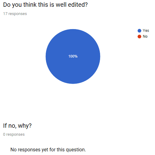
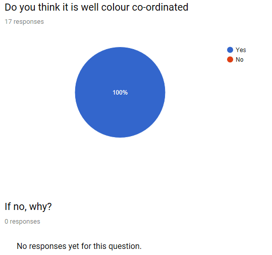
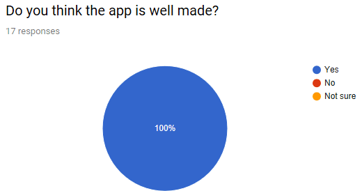
In this screenshot above all the people who took the survey said that the film was well made with the ration of 100%. I asked this question as I could find out what people thought off the short film itself but also if the planning and other things worked to create the piece. If someone said no I gave them a chance to say why but as I got 100% I had no further comments.

Screenshot (106)

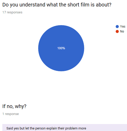
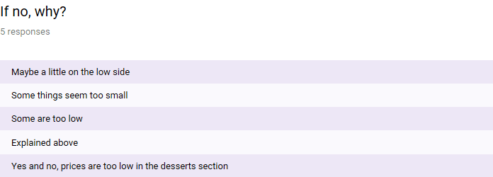
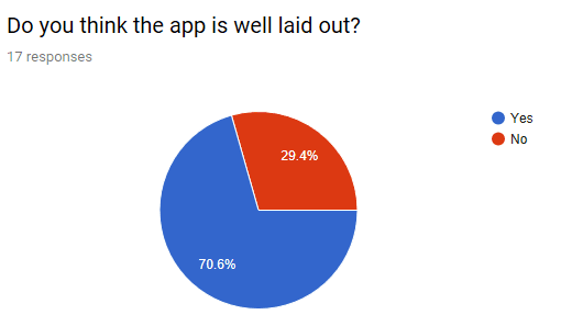
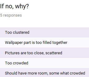
From this screenshot above I had asked if they understood what the short film was about as this was the aim of trying to create the film so they can understand a situation a bit more. Again, everyone who took the survey said they understood the documentary but even though the 100% of people said yes I still gave an option for those if they said no. There was a comment left on the no part and I agree with the comment as people may experience the problems said but her case was different as with the headaches came sickness.

Screenshot (107)

Screenshot (108)

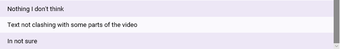
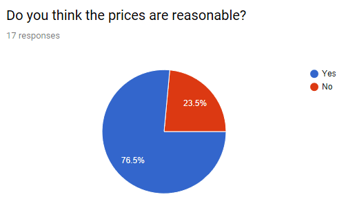
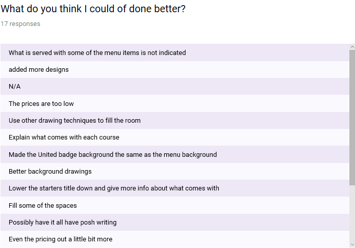
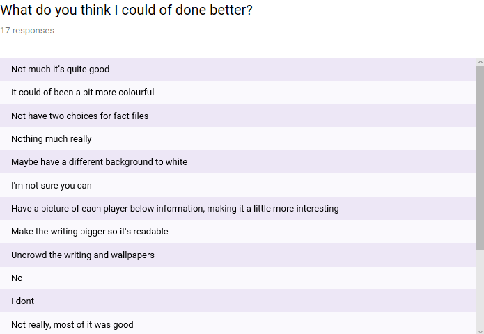
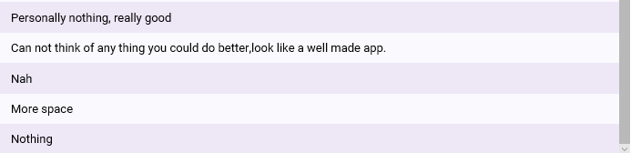
This question that is shown in the screenshot is for any future projects that I may do that is similar to this project. Most of the replies I got is that they think nothing could make this piece better or are not sure that it could be. Two comments was saying that it needs to be more paced out or smoothed out, which I agree with as one clip is sped a little too much compared to another one that is used. Another comment I got was to make sure the text is not clashing with some of the shots that is included in the video, which I agree with because in the gaming shots it clashed with parts that’s included in the game towards the bottom.

Taking in the feedback from the survey the things I would change if I was to do a project similar to this again is the text not clashing with the clips on the screen by possibly using a different type of overlay, where it could possibly stand out more. The other thing I would do is make some clips that are sped up or reversed are more paced out compared to other clips.

I feel like the short film documentary has a little inside to life one minute at a time. Even though most of it is surrounded by gaming but there’s other information that is included about the persons disability, what they do to distract themselves from day to day and symptoms so people know more but also can understand some of the things the condition brings. The main reason why I think this has a little bit of one minute at a time is because on some days as a family it is chosen to play games although this shows Kim Davies playing on her own, including audio of other hobbies of hers that keeps her distracted. Explaining a little bit more of what happens day to day, some help that is given while in a crowded place while being partially sites and also an insight to what kind of feelings she feels when something is affected from not being able to see.

I demonstrated my planning stages through multiple blog posts, including the process of trying to complete the work and then the finishing stages of the project. I’ve used legal documents for the filming process parts, as this is what would happen on a filming set so the people involved cant go back on their word and are surrounded by copyright plus any other laws surrounding filming and so on. Before doing the planning stages as part of the project I had to find out more about people who had some kind of influence in the media industry when it wasn’t really well known. Other research into 60 second documentaries to see how each one is done, maybe different to other ones so it gave me an idea on what to include, what kind of questions to ask and what type of videos I want included within my own piece. Apart from legal documents, the other things that needed to be done was the interview prep sheet so they questions were known to Kim Davies.

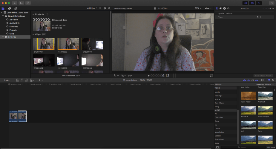
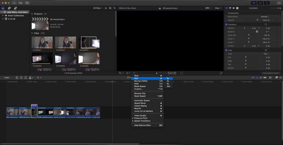
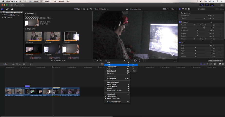
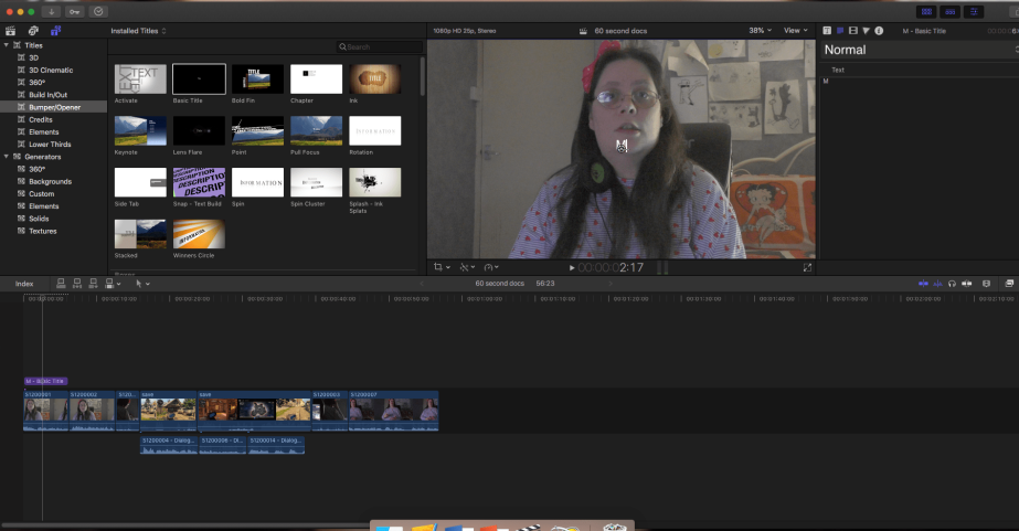
I used the interview to shape the documentary by using the answers and not the part of  me asking the questions. To do this documentary I was using Final Cut Pro, where I was able to edit every clip that was recorded and include some parts of audio where I choose which parts I wanted included but also within the interview part if I use the on screen part. I had to repeat one of the clips but reverse it as I forgotten to film a clip of it going back to her finishing the game. Adding text over each clip so you can understand what is said along with the low background noise.

The interesting discovery I found out while making this work is past things about media production from the past. Within my own work it was the many different documentary planning stages, more the interview stuff. This being because it gives you more of an idea of what it going on in the film that is going to be created instead of coming up with the questions on the spot. The only problem that happened while filming is that the mic that I had booked didn’t give a good enough sound when recording the first parts so used the cameras microphone, where the sound was picked up better. Another little problem that happened while filming was that Kim Davies would get scared of the camera being there meaning she would forget what things she was meant to say in some parts.


Process of creating 60 Second Documentary

screen-shot-2019-02-12-at-1.46.05-pm.png

In the screenshot above I am showing that I went through some clips and seeing which parts I wanted to use the most out of those clips before dragging them and added it to the part where the clips will be part of the video fully.

screen-shot-2019-02-14-at-2.46.26-pm.png

This screenshot shows that after I picked up all the videos I wanted to be included in the final video. I then picked up one of the videos that I thought would benefit by going a bit quicker as there’s no speaking just the sound of a moving chair. So I sped that clip up by 2.

Screen Shot 2019-02-14 at 2.49.57 PM

At this point I realised that I hadn’t got a clip of Kim putting the headset off so I reversed the clip so it would play backwards. I went on to try and see if I could make it faster, only it deleted the reversed clip so I went back and put the reverse clip back on.

screen-shot-2019-02-15-at-11.41.17-am.png

In this screenshot I was showing that pressing command shift and g I was able to split the audio from the clip. I was able to then delete the clip and put the sound where ever I wanted it to go.

screen-shot-2019-02-15-at-11.54.11-am-1.png

In this screenshot I am trying to show that I am planning to use text in the video like seen in the 60 second documentary blog.

Secondary Research

Below is a website that explains in more detail about the condition that I am relating to the 60 second documentary. This site helped me in using it for the script but I could find more information out about someone who lives with this condition which is helpful. This is a more in depth explanation about the illness giving facts and more information about what causes it, treatment and other things that I may not be able to go into in the video.

Henderson, D. (2019). Idiopathic Intracranial Hypertension. Learn about IIH. [online] Patient.info. Available at: https://patient.info/health/idiopathic-intracranial-hypertension-leaflet [Accessed 15 Feb. 2019].

Reflection

Final Menu Piece

Menu crop.png

When looking at menus created by other football clubs and doing primary research I had gathered that the one thing I needed to tackle the most is the price. This being wether theres prices on the menu or it is being way overpriced for what is given. With keeping in mind the feedback of this I tried to keep to keep the prices lower, maybe a little too low if the club wants profit. I also needed to make sure that I didn’t pile the menu with a lot of information as people may loose interest in it quick and pick something easy if its time consuming.

The other thing that I needed to do was make sure that anything I put into the menu had something to do with the club, that’s the reason for the premier league trophy as United have won 13 of these, the shirt being the thing the player always die for and the football pitch as you cant play football without a pitch. Also needed to make this colour co-ordinated. I feel like the solution has been effective but the one thing I would change is the detail in the trophy, short and pitch or I could of drawn out certain players if I had more time and understood some more features.

Added other feature like Red Café as that is what the café is called within the club and this wasn’t of the things I aimed to change but thought would be a good addition. Then the we’ll never die is aimed from those that died in the Munich Air Disaster but also talking about the club in general, almost a little tribute that most Manchester United fans may rejoice over if they saw this in the background of something.

To see what other people thought of the menu I created a survey. This survey will allow me not only to know what other people think about the menu but it will ask questions about the problems I wanted to solve from what the target audience had said in my primary research. This is good as I will get a range of answers and will also tell me what things could be improved if I was to do this type of project again in the future. The problem with doing a survey is if I ask any of my mates to take the survey then I may not get proper replies that I’m looking for.

To start the survey off I showed a final product of what I had created so they knew what they was going off. The rest of the replies to the survey will be shown in the many screenshots below.

screenshot-84.png

Screenshot (85)

The first question I asked as shown in the screenshots above is what people thought of the menu. The main reply I got is the selection of food which is one of the things I aimed to solve when trying to make this piece. Other things like the use of colour, whether there was too much information on the menu and fonts are also some of the other things I  wanted to challenge as this was seen to be a problem in some menus as seen by my primary research. Other things like how it was laid out with text and the pictures was also good to see and good to be recognised amongst everything else.

Screenshot (86)

As stated in the above one of the problems I wanted to resolve is making sure that the menu is well colour co-ordinated, this is why I asked this question. As the screenshot shows everyone I asked to take the survey gave me a 100% that it was well done. I did give the option for people if they said no to explain so it could help me learn from it in future projects.

Screenshot (87)

Another problem I wanted to solve based on my primary research is the high prices that was shown in one of them. This is why I asked this question, it allowed me to see if I had made it cheaper with a better understanding of what you are getting within some dishes. The majority of people (76.5%) said that the prices was reasonable but 23.5% said that it wasn’t.

Screenshot (88)

To find out why people said no I gave an option to say why within this question. The main reply being that the prices are somewhat low in some places. I can agree with this especially within the desserts one which is stated in the screenshot above but also in the drinks section. If I do this project like this I will do multiple google searches about menus and the prices to get more of an idea how to price the food/drink better.

Screenshot (89)

Screenshot (90)

I asked the people taking the survey the best way in which I could improve the piece as the screenshot shows. I got quite a mix result on things I should do. One I recognised is adding more designs to fill the room that was left in some places, I was going to add names of those who died in the Munich Air Disaster but it didn’t mix too well with the idea. Other things about the font was to possibly try to have posh all the way through but if I did that there’s a chance that it may not be able to be read. Prices are mentioned again within this questions. A few people said there was nothing that could make it better. Another reply I recognised is that I don’t explain what could come with the dish on the side or if it doesn’t and people buying need to do this.

One thing I know I should of done is write about allergies and any food difficulties as if someone was ordering they would like to know or at least be able to ask. This would be a problem as it could have consequences if they decide to eat something they don’t know could have anything in there.

Final Evaluation

As the website I was using wanted me to pay for the app to publish so I recorded myself going through the app changing the wallpaper on my phone and showing some of the information within the clip. This will be shown below.

The video shows the type of images that was able to change a persons phone background. I wanted to create a mix of players that are from past and present that has had some kind of impact on the club, this is what I did as shown. The other part that is shown in the video is the fact file of some of the players included in the wallpaper section and the aim of that was to try and tell someone a fact they may not know.

If you cant read the fact file part here is a couple of screenshots that shows what is talked about.

Screenshot (92)Screenshot (93)Screenshot (94)Screenshot (95)

Screenshot (96)Screenshot (97)

To see if I solved the problems or done the things people said I should in the primary research I set up a survey. This well tell me what I met and what I didn’t but also gives an outside view of the thoughts of the app. To start the survey I added the video above but in the description from the title I explained why I couldn’t have them use the app and give feedback having used it.

Screenshot (98)

In this question I asked the target audience who took the survey if the app they saw in the video was well made. I asked this question as if the app isn’t made well then it wouldn’t benefit the target audience and would get bad results in the app store. I gave multiple options for this to see if there is any contrast in the answers but all the people who took the survey said yes.

Screenshot (99)

One of problems that I needed to solve from the primary research conducted but also some secondary is that it needed to be laid out in a simple way for those who are not very tech worthy, this is why I asked this question. The majority of people (70.6%) said that it is while 29.4% said they didn’t.

Screenshot (100)

To find out more about why they said no I left a question asking why they said no. The main reply is that most of the pictures was way too close to each other, which could possibly take the interest out some pictures.

Screenshot (101)

Another thing that I wanted to solve was that there was a great selection of players whether that was past or present and contributed to club in their own ways. To see if I did solve this I asked if there was a great selection and 100% of the people said yes it was but I did add an option to explain why if they said no. Someone who said yes answered in the no part saying that some of the pictures could look blurry. If this was the case then I would of removed the picture for another one.

Screenshot (102)

At the start of the project when I was trying to think of something to do, I said I would add information about the players, club and the greatest manager ever Sir Alex Ferguson. Possibly having this below players but this couldn’t happen as this wasn’t an option so I added another tab in the hope that I would be able to do something that related. That’s what leaded to this question whether the information was a good addition to the app even if it couldn’t be with the players and 100% said yes it was.

Screenshot (103)

Screenshot (104)

If I was to do the app again I would need to know what kind of things that I would need to improve on. That’s why I asked the people taking the survey what they think I could of done better. Most of the answers I got said that there isn’t anything I could improve and the ones who said that something should be was mixed. Starting with that the app should of been more colourful for backgrounds, which using the website I was it wasn’t possible as it only allowed the headers and the title boxes to be changed. Other things included is that the writing shouldn’t be too close together, be bigger so its readable, within the fact file have pictures below each players information and the fact file shouldn’t have two parts.

There wasn’t really any problems when in the planning stages but when in the production phase the app making website Appypie it will ask to pay at the end as the app can only be edited after for at least 48 hours after creating the app. Other problems I had within the website is that when I created the app and tested, the images wouldn’t show up that I had added which is one of the key things that I needed to be within the app. So to combat this problem I researched for other app making websites as well as testing them to see if they would work, some was complicated to use and one that wasn’t complicated was AppsGeyser. The problem I came to in the end of this website is that it needs to be paid for before it can be published, that’s why I used another way of showing how the app works in a video.

The target audience I asked at the start of the project by primary research helped me in considering things about the app when in production in many ways. One of these is how the app should be laid out for the less tech worth people or if there’s anyway in which a person like their apps to be. The other thing that I needed to do in targeting the target audience is the players that were listed are available to have multiple options of more than one player whether its part or present, manager or club badge. Also adding the information of players as most fans are die hard and if a fact is wrong they’ll know.

Production of App

To create the app I used AppsGeyser, before this i used AppyPie but the website required you to pay most times and when I tested the app it didn’t have the things I added or while creating it would delete if you try to save the work. This app I used was easier to use although I needed to try look carefully to try and add more than one thing to the app like I needed. The problems I face while creating the app is that I need to have a good enough selection that I know other fans may appreciate, another thing I need to control is the copyright on most pictures if I am taking from the internet. All player information needs to be correct or theres no need to give facts if they aren’t correct. These are the type of problems I need to tackle while making this app.

screenshot-71.png

In the screenshot above this is the starting page that the site comes up with, these options wasn’t the one I was looking for.

screenshot-72.png

This screenshot shows that I explored the page to see if I could find anything that would suit my idea.

Screenshot (73)

The one I thought would suit the most from these options and the explanations is this wallpaper option. Mainly because my idea included backgrounds for phones.

Screenshot (74)

This screenshot shows the information that was given to me from the start of clicking on wallpaper. One important thing is that I am able to preview the app before publishing, allowing me to go back and change things before the app is made.

Screenshot (75)

In the screenshot above shows the next part that I needed to fill in. Album name is important to fill out so other fans know what its for and where to click to get this. Any images I add into this app that are copyright I need to give credit for.

screenshot-76-e1550168315168.png

In this screenshot above you can see that I have added a name to the album but also some pictures, relating to the club. While doing this trying to make sure I keep the app simple which is one of the problems I aimed to solve at the start of the project.

screenshot-77.png

When I finished adding all the pictures I wanted in there but also including those people stated in the primary research I conducted. I pressed next to see what else I need to do.

Screenshot (78)

After clicking next like shown in the screenshot above I was asked to put the name in the app and to be able to aim the app at United supports I needed to include their name within the title.

Screenshot (79)

I then gave a description about the app and as seen to the right of the box I have tested the app from the site to see what it will look like a little bit more.

Screenshot (80)

In the screenshot above it shows that I was then able to choose an icon for the app and I can upload my own as long as it fits the measurements.

screenshot-81.png

This is the picture I chose to have as the app icon and here I was able to crop the image to make it fit the measurements.

Screenshot (82)

This screenshot shows that I have uploaded the image and the only thing I can do next is press the button “next”.

Screenshot (83)

On this screenshot I am showing that I am able to change how the navigation of the app is done.

Process of using Affinity Design

Screen Shot 2019-02-01 at 13.46.28 copy.png

In the screenshot above I have embedded work that I have done when trying out the software but before I did that I added a rectangle which is the background and is red like the colours of the club. After embedding I was exploring fonts and came across this one and decided I needed to test colours before deciding on one, keeping a theme which is the problem I wanted to tackle when planning the menu.

Screen Shot 2019-02-01 at 13.46.15.png

This screenshot shows that I feel white was a better choice to go with the red background but also because of the badge in the top left being black.

Screen Shot 2019-02-07 at 12.23.48

This screenshot above shows the Premier League trophy and like my drawing show in the sketches blog is part of the menu idea. As you can see from the outline and to the right where layers are shown I have gone round it with the lasso tool.

Screen Shot 2019-02-07 at 12.23.43

In the screenshot above the Premier League trophy outline is shown by itself unlike in the other screenshot above. When moving the trophy I will be able to collect them all and move it over to the menu before grouping.

Screen Shot 2019-02-07 at 12.55.40

In this screenshot above I had selected all the layers that created the football pitch and pressed command and right on the mouse to get group up and grouping the pitch making it easier to move when I need to.

screen-shot-2019-02-07-at-13.15.24-1.png

In this screenshot above I needed to find a font that would suit everything I had done to this point, keeping classy but also keeping it simple so people can read the text.

Screen Shot 2019-02-08 at 13.36.07.png

In this screenshot I was still deciding on the writing I am going to use for the main part of the menu but realised that at this point that it would be better if I underline the words starters, mains, desserts and drinks.

Screen Shot 2019-02-12 at 10.16.37.png

In the screenshot above I wanted to try and see what things would work well within the menu and I needed to make the prices somewhat away from the writing so I tried using the eclipse took to do this. Also testing which colour would go with the theme.

Screen Shot 2019-02-12 at 10.19.56.png

In this screenshot I have tried it more but realised that this wouldn’t suit the design and could possibly not be straight.

Screen Shot 2019-02-14 at 12.35.39.png

To see this more I tried to do this in the top corner of the menu but to get more than one I am showing that I am copying and pasting so they will be the same size.

Screen Shot 2019-02-14 at 12.36.50.png

Again having done more I realised that this wouldn’t work the way I wanted to as they may be too squished together or wouldn’t be lined even with the grids on.

screen-shot-2019-02-14-at-12.41.41.png

In this screenshot I have gone back to previous logo making I did in another lesson and took of the background colour but when I switched the logo it has the many layers that made up the badge so I had to group it which is shown here.

Screen Shot 2019-02-14 at 12.52.50

This screenshot shows that from the change in colour of badge I could use it to my advantage and use these as the dots that break the dish to the price.

screen-shot-2019-02-15-at-13.38.56-1.png

The screenshot above shows that I did this for every part to the menu.

Contextual Awareness

screenshot-63-e1549901969180.png

screenshot-64.png

screenshot-65.png

Screenshot (66)

Screenshot (67)

Screenshot (68)

Screenshot (69)

Screenshot (70)

In these various websites are some menus that clubs have stated. This will help me in solving a problem of using a more simple food selection in each category while still having some class within the menu. A good idea to have the final output by putting it onto a website where everyone who is going to the club knows what is offered, only if I was to do this I wouldn’t have it laid out like these pictures show above because it may not get read as it seems boring. This gives me an idea that every bit of food can be different but so other people know what kinds of dish it is, what’s involved and so on. So to solve this problem I will state the dish and below I will write what is involved within the dish.

Another problem I plan to sort out is how much each dish costs. One thing I’ve seen from the primary research I did is that there has to be decent portion that matches the price because people may not buy as it may be too over priced for some people. With this I’ve gathered that if the menu is based on a football club then the club badge has to be involved so people know what the menu is for and what its for. The top screenshot of the menu is more likely to catch a customers/clients eye as it is the clubs colours, the club badge shown visibly and a plain coloured menu because of colour but with the selection itself there is quite a lot but I want to aim to have something everyone like, more of a mix and food they like.


Secondary Research

Typefaces of fonts can have similar design features. Every font have specific weight, style, width, slant and designer. In this link below is a link to typefaces that have been rated from top of the list to the bottom of the list. The best that could be printed off, like most menus have to be when used in a restaurant. This website is useful as I can look at some of these fonts when creating the project and see which one could provide an almost posh looking menu but keeping it complex.

Prepressure.com. (2019). Top 33 fonts | The best typefaces for print. [online] Available at: https://www.prepressure.com/fonts/interesting/important-typefaces [Accessed 7 Feb. 2019].

As I am creating a menu I wanted to find out what other fonts people think are good for this but also baring in mind that I want to keep it complex so it is easier to read. With doing this research I can also try out some of these and see if it suits my idea and theme. Test them with other things I want to try on the menu and staying to a certain colour theme.

McCauley, J. (2019). 10 mouth-watering restaurant menu fonts. [online] Creative Bloq. Available at: https://www.creativebloq.com/inspiration/10-mouth-watering-restaurant-menu-fonts [Accessed 9 Feb. 2019].

The PNG file is a Portable Network Graphics file. PNG files are mainly used to store graphics online. The issues with the PNG file is that it doesn’t support animation, can’t store multiple images in one file and it is isn’t that great working with full colour images. Older browsers can struggle supporting PNG files. PNG files allow transparency on a scale between opaque and completely transparent, for a faded but translucent look. It can be put on any colour background and keeps original appearance.

Lifewire. (2019). What’s a PNG File and How Do You Open One?. [online] Available at: https://www.lifewire.com/png-file-2622803 [Accessed 10 Feb. 2019].

Logo Design Blog | Logaster. (2019). Advantages and disadvantages of PNG format [Infographic]. [online] Available at: https://www.logaster.com/blog/png/ [Accessed 10 Feb. 2019].

JPEG means Joint Photographic Experts Group. Mainly bitmap images are saved in jpg form so the files can be compressed, making it easier to transfer or download the film from the internet. This file format is based on  24 bit colour palette but these type of files are known to drop information which makes the file decompressed. The problem with this file type is that at each stages of compression the file starts losing sharpness making the image look worse. The final result of using Photoshop for graphics or text then it may not come out the best.

File.org. (2019). JPG File – What is it and how do I open it?. [online] Available at: https://file.org/extension/jpg [Accessed 10 Feb. 2019].

Moodie, M. (2019). Pros & Cons of Shooting in JPEG: What you Need to Know Today. [online] Sleeklens – Handmade professional Lightroom presets. Available at: https://sleeklens.com/pros-cons-of-shooting-in-jpeg/ [Accessed 10 Feb. 2019].

PDF stands for Netware Printer Definition File.  PDF files are mainly useful for magazine articles, product brochures or flyers if people want to preserve their original picture online. PDF files can have more than one page, can zoom in and out as well as page forwarding and backwards. The cons of PDF files is that they cant be edited for free, need to be edited in specialised programs and it is difficult to with text in PDF files because they are seen as a picture.

Rouse, M. (2019). What is Portable Document Format (PDF)? – Definition from WhatIs.com. [online] WhatIs.com. Available at: https://whatis.techtarget.com/definition/Portable-Document-Format-PDF [Accessed 10 Feb. 2019].

Logo Design Blog | Logaster. (2019). Advantages and disadvantages of PDF format. [online] Available at: https://www.logaster.com/blog/pdf/ [Accessed 10 Feb. 2019].

Below is a link to what some colours may mean. This is important because I don’t want anyone to get confused as to what the aim of the project is because of how they perceive a colour. This good be a problem when creating the menu so to try stop this problem happening I will try and use ones that don’t give out warnings.

Color-wheel-pro.com. (2019). Color Wheel Pro: Color Meaning. [online] Available at: http://www.color-wheel-pro.com/color-meaning.html [Accessed 10 Feb. 2019].

In the link below is many tutorials to how to do things that I may not know how to. This web could help me when I’m not sure on how to do things that would benefit my work but also the simple things that may of been forgotten while making.

Vimeo.com. (2019). Affinity Designer. [online] Available at: https://vimeo.com/channels/affinitydesigner [Accessed 11 Feb. 2019].